Google+ New Look
Google has announced a refresh of Google+ on Wednesday.
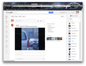
There are a lot of new features incorporated with the new look. The new look is a responsive layout which can be fitted on different sizes of monitors. The static icons on the top are reorganized on the left and users can reorder or add new features by simply drag-n-drop to the list. Google+ is now easier to chat and create Hangouts.
See how people utilize Google+ new look with their work and life by visiting #usesforwhitespace. Do you have any great ways of using the new Google+? Please share with us.

