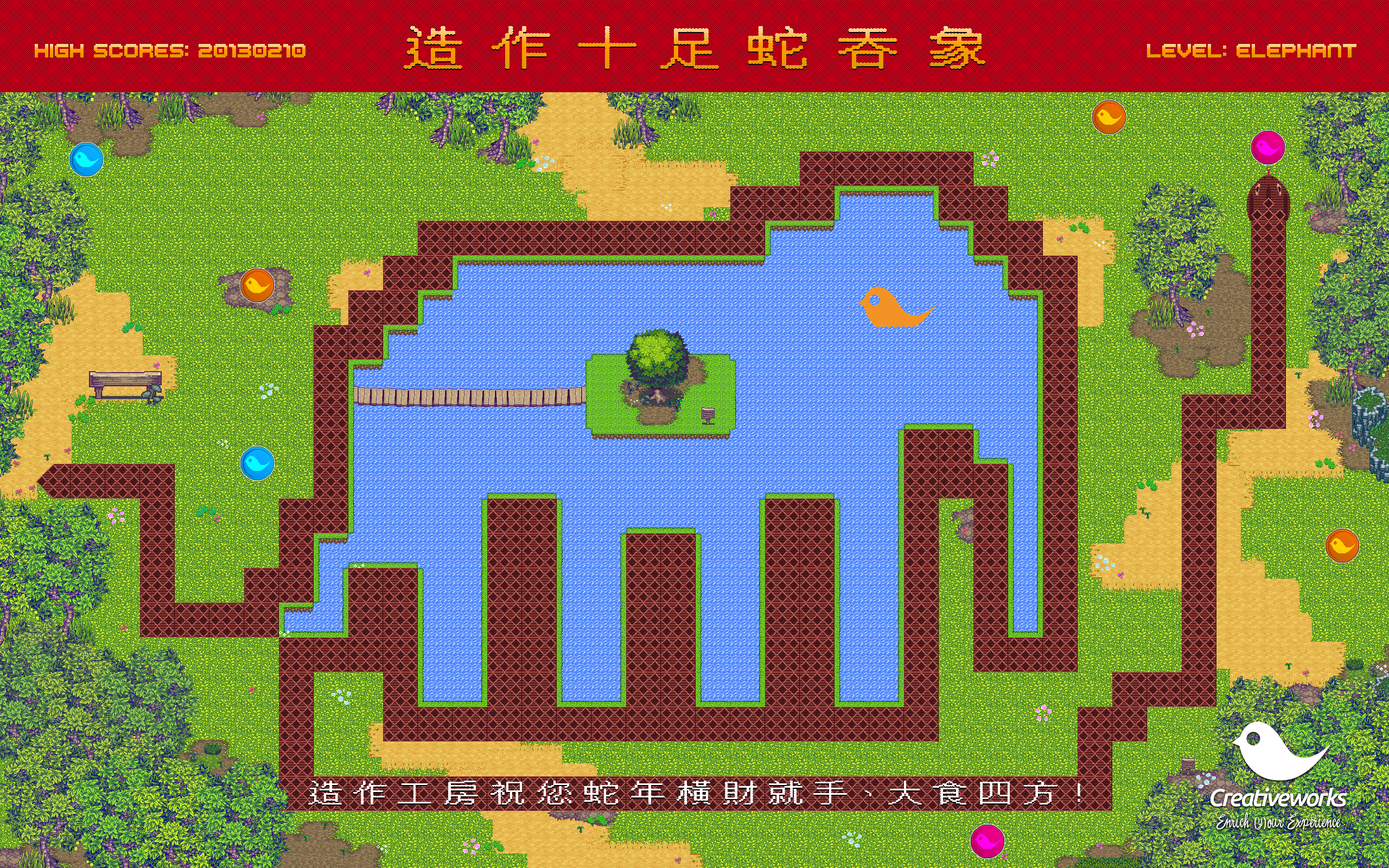
造作十足蛇吞象!造作工房祝您蛇年「橫財就手」,「大食四方」!以上是我們最新的桌面壁紙,請隨時到 http://www.creativeworks.com.hk/downloads 下載並為你的桌面增添新年氣氛。認得這條蛇嗎?沒錯!它就是名震江湖的貪食蛇,趁著蛇年,不如回顧一下貪食蛇的歴史吧!貪食蛇是 70 年代後期出現在街機及個人電腦上的小遊戲。以下是個人電腦 TRS-80 的版本,於當時這已經是很先進,而且畫面也挺豐富的,只從畫面看來難度一點也不低。直至 90 年代 IBM Compatible 個人電腦普及,要玩貪食蛇就簡單得多。若那時有一台運行 Read more [...]
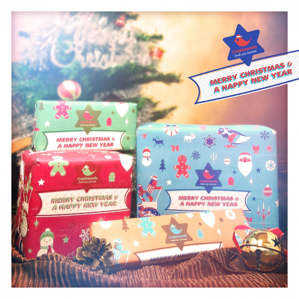
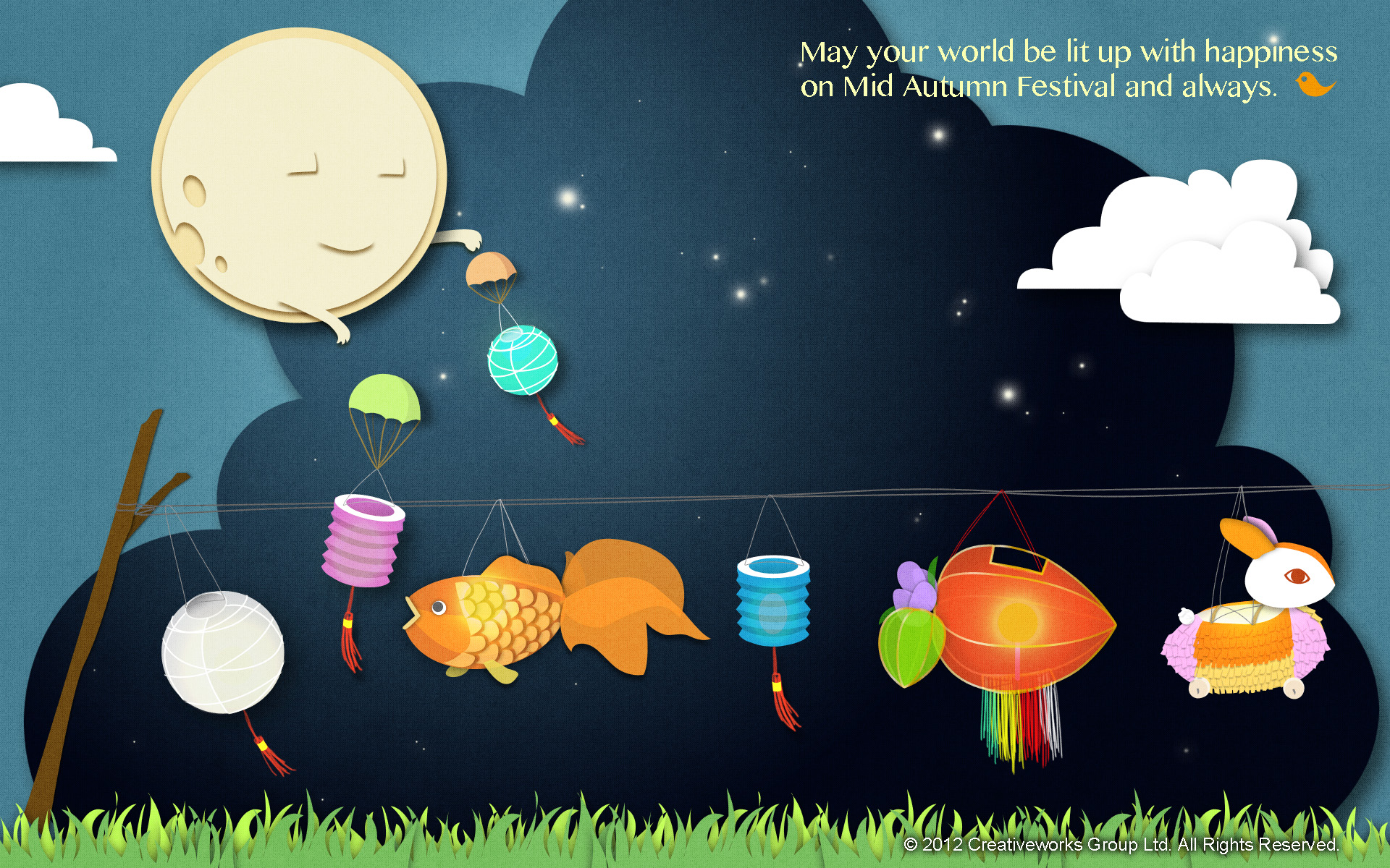
在這個普天同慶的日子裡,造作工房祝大家「聖誕快樂,新年進步!」我們為大家準備了2012聖誕版的電腦壁紙,喜歡我們的朋友可以下載為你的桌面增添一點聖誕氣氛;若你正準備今晚聖誕派對的聖誕禮物,不妨下載我們的聖誕包裝紙,你可列印在再用紙上減少浪費。Creativeworks Group 2012 聖誕壁紙及包裝紙可以從以下網址下載。http://www.creativeworks.com.hk/downloads Read more [...]
We are happy to take part in designing the promotion for the HK Racing Museum of Hong Kong Jockey Club. Hope visitors will get to know more about the racing history of HK. Terence Lam, Managing Director, CreativeworksAbout CreativeworksSince the establishment in 2005, Creativeworks has helped various clients to achieve their marketing objectives by applying integrated methodologies which comprise multi-media, creative design, social media and digital marketing. Our clients include AIA Group, All Nippon Airway, COACH, Ernst & Young, Hong Kong Cyberport, Hong Kong Jockey Club, Hong Kong Polytechnic University, PCCW and University of Hong Kong.For further Read more [...]
Friends, we are recruiting Art Director. He or she will oversee the art direction of all the company's internal and external projects. As you may know, our projects cover a wide range of media, from a printed ad to a mobile app, from a leaflet to an annual report.CAUTION! We are a small, young and energetic team. While we enjoy the process, we are definitely result-oriented. We love to facilitate an employee-friendly working environment to ensure highest output will be delivered from you. In order to stay in the league with other giant agencies, we have our unique way to provide competitive solutions to our clients, and this requires your enthusiasm and passion.For details of the JD Read more [...]
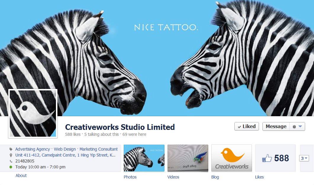
近日不少客戶向我們查詢Facebook Page的事宜,似乎很多品牌都忽略了Facebook強制性全面採用Timeline後對舊有FB Page的影響。最直接的影響就是外觀。按我們目前的觀察,其實有很多公司沒有就Timeline的出現去改善其Page的介面,令到Page的外觀出現不協調的地方,最典形的問題有以下三種:一、Profile Pic及Cover photo的配搭出問題,例如兩者不協調,甚至是Profile Pic破壞或阻擋了Cover photo想表達的訊息。當然,不排除有部份Page是沒有Cover photo。二、沒有留意位於Profile Pic下面的介紹的面積限制,令所寫的內容超出框框。三、沒有用盡新的增大了的闊度,令部份Apps看來怪怪,因為左右兩邊多了很多虛位。可幸的是,我們亦看到一些品牌真是認真應對Facebook這改變並作出較別出心裁的設計。有些心思是比較明顯,有些則要細心觀察,不多說,一圖勝千語:FantaNokiaBiothermM&M'sMacy's當然,還有我們Creativeworks的FB Read more [...]
